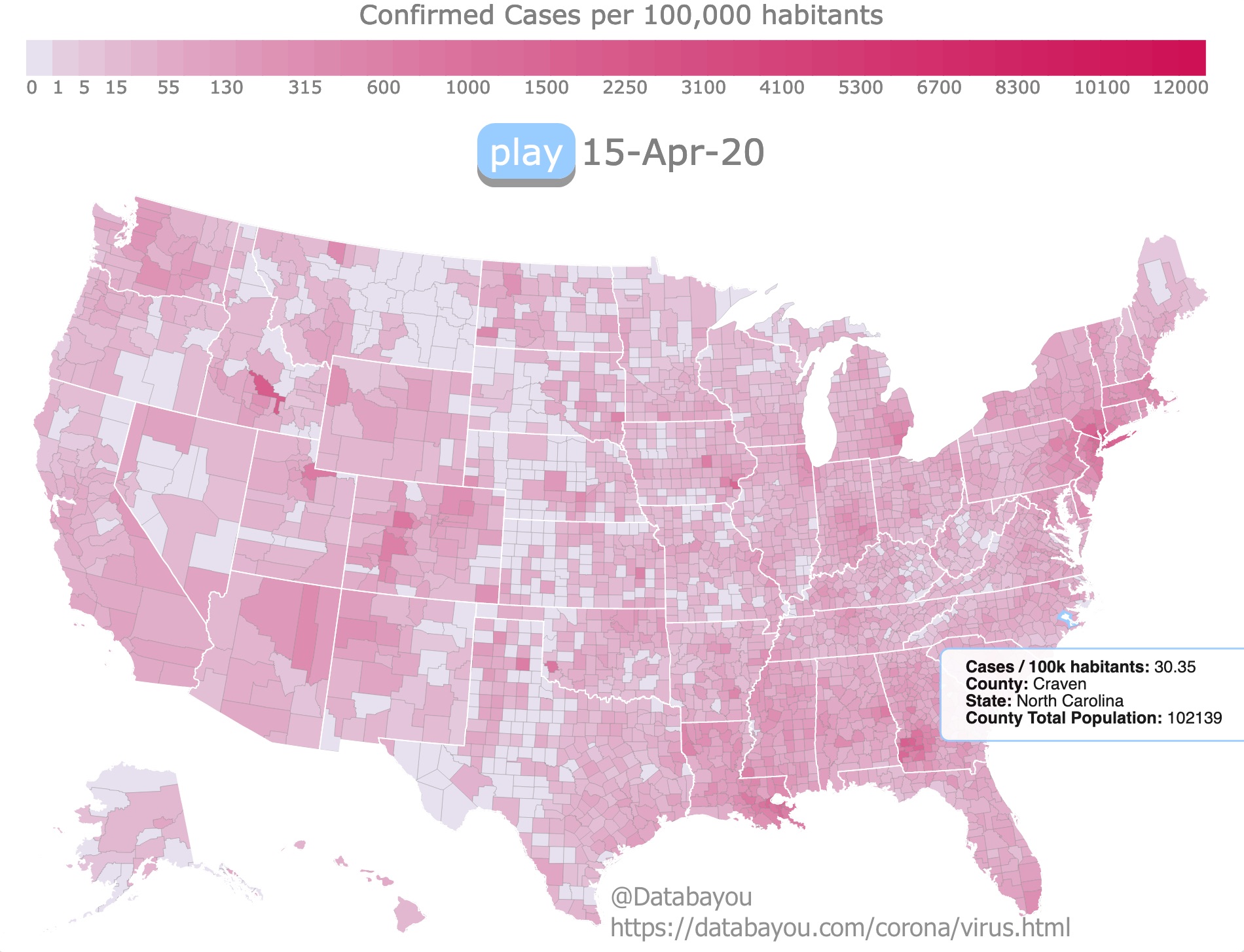
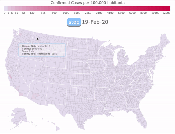
Legend
This is an animated Choropleth map of Coronavirus cases in the USA. It shows confirmed cases per 100,000 habitants in each county. Darker red represents more cases. The timeline shows cases every day since January. Therefore this map will be updated with new data every week. It shows how the values cases have change between January and November 2020. Because the values have increased exponentially, the first color changes are observed in February and increase slowly at first but are widespread by September. The data includes case progression and population by county
I wanted to make an animated map that showed the changes and progression of the pandemic. This map also gives the opportunity to stop and hover over areas of interest and highlight for more information.
At first I made an animated dot map with data from CNN. Since then, the cases progressed so much it was more appropriate make a choropleth map. This data only includes cases assigned to a county.
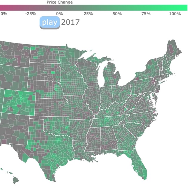
Health and population growth affect home value. Check this map with Housing Prices.
Sources and Inspiration
The data on confirmed cases per county and population by county was obtained from USA FACTS. The shapefiles for the map where downloaded from ESRI. The colors were chosen from the Color Brewer. The code to make an animated choropleth map, was altered from rfdonohue's block.
At first I was underwhelmed with the data found on Coronavirus. I read criticism on different visualizations of COVD-19 cases and how it was displayed. I just wanted to show a map with the daily progression of the desease. I realized the best way to do it was with an animated choropleth map.
If you would like to see more visualizations on population take a look at Population Pyramid by Race and Population Pyramid by Ethnicity.
FOLLOW ME
Made by Luz K. Molina with D3.js.