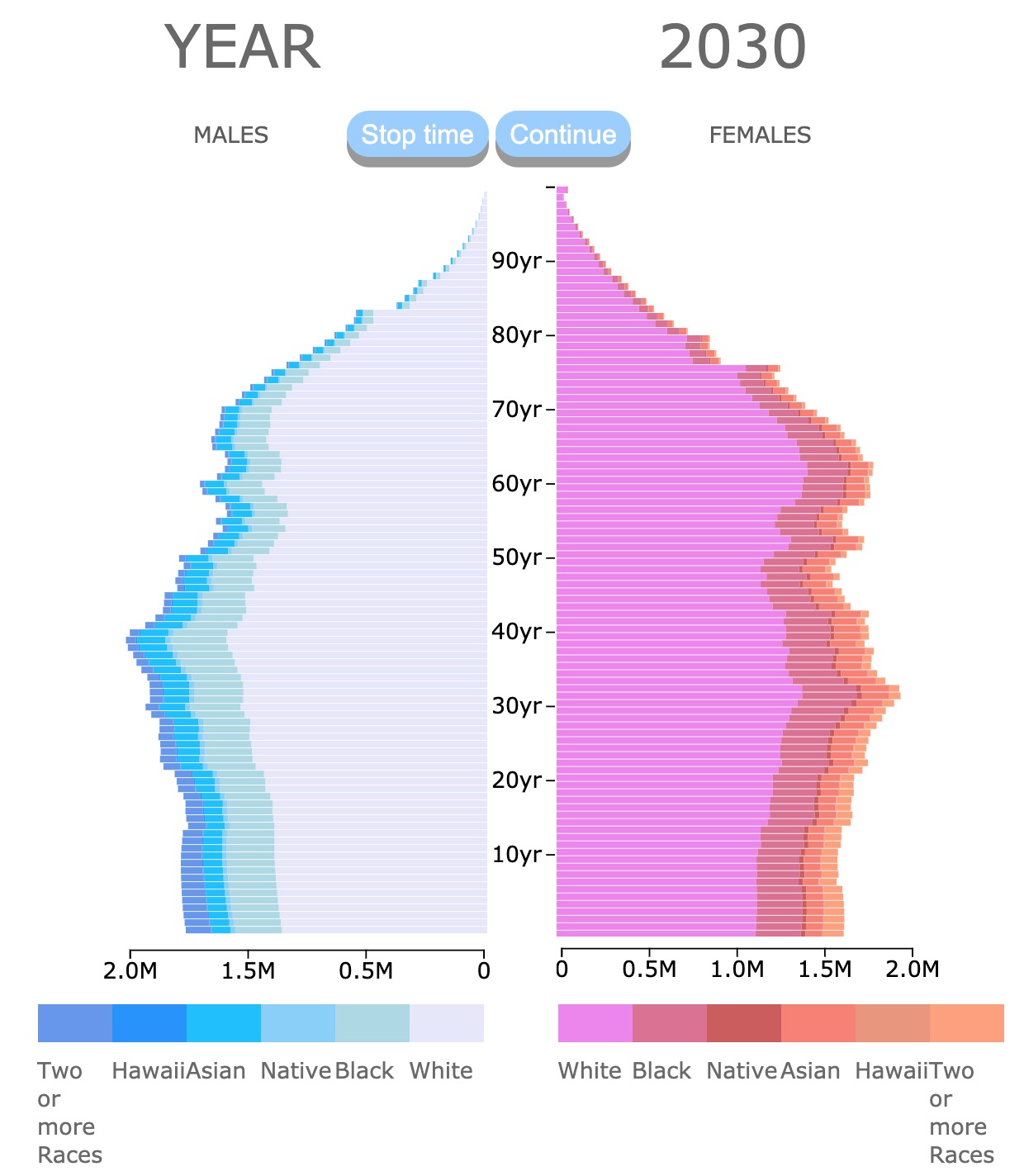
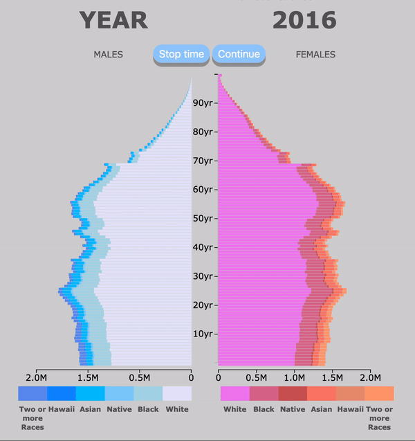
Population Pyramid of the United States by Race
This animated population pyramid displays the projected population of the United States. It includes information about Sex, Race, and Age, from 2016 to 2060. Every bar represrnts 1 year. The population values are given in millions. For more information scroll down.
Pyramid Legend
| ♀ | ♂ | KEY | DESCRIPTION |
| Two or more Races | Two or more Races | ||
| Hawaiian | NHPI: Native Hawaiian and Other Pacific Islander alone | ||
| Asian | Asian alone | ||
| Native | AIAN: American Indian and Alaska Native alone | ||
| Black | Black or African American alone | ||
| White | White alone |
The Data was gathered from Population Projections Datset by the US Census Bureau.
Population Pyramid
Population Pyramids show the age and sex structure of a nation's population.
They may provide valuable information about a nation's social stability and economic development.
This population pyramid shows the female population on the right hand side, and male population on the left hand side.
Each side may be broken down into age groups. Age groups in a population pyramid can be categorized as follows:
- 0 - 14 years: Children
- 15 - 24 years: Early Working Age
- 25 - 54 years: Prime Working Age
- 55 - 64 years: Mature Working Age
- 65 < years: Elderly
This pyramid is broken down into 1 year bars.
The shape of a pyramid is the result of fertility, mortality, and migration.
The age structure of a population may affect its economic development.
Countries with high fertility rates tend to grow economically, countries with a young population need to invest in education.
Countries with older demographics need to invest in health services. Source: IndexMundi.
Demographics
There are different types of population pyramids. They are characterized by the stage the country is in.
The USA is in a Constrictive pyramid. Therefore, the base is narrower. This is because of declining birth rates. Each age group is smaller than the previous one. Source: U.S Demographics.
The Baby Boomer generation, born between 1946 to 1964 result in the widest bars in the pyramid. Baby Boomers where the product of high fertility rates after World War II. They wer born between 1945 and 1965.
Generation X, were born between 1965 and 1979. This is a small generation, not just because their parents showed a low fertility rate, but because it only spans 16 years. Boomers span 20 years.
For more information on Generation X demographics, I suggest you read this book found on Amazon called Gen X at Middle Age in Popular Culture (Generation X: Studies in Culture, Demographics, and Media Representation).
The other bulge in the pyramid comes from Millennials. They were born between 1981 and 1996. They are between the ages of 21 and 36. They have the most widely represented age of 26.
Currently Baby Boomers are retiring and Millenials are entering their prime working age. Busienssinsider.
Another bump or wider bar is observed on the female side. This is because women tend to outlive men. Therefore, resulting in a larger group in the after 80's population. Source: Census.
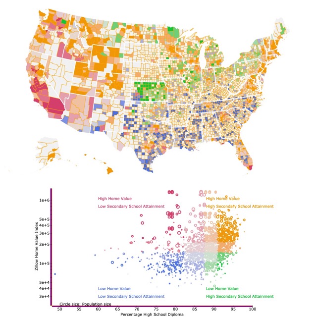
Map of Education and Home Value
Population of the U.S. by Race, projected for 2017. Ethnicity not included.
- White:73%
- Black or African American: 12.7%
- American Indian and Alaska Native: 0.8%
- Asian: 5.4%
- Hawaiian or Pacific Islander: 0.2%
- Two of More Races: 3.1%
These are total numbers. What these numbers don't mention, but it is visible in the animated pyramid is that younger generations are growing in a more diverse society.
Asian and Black population are growing at a faster rate. So is Latino population, not shown in this graph.
To see Latin or Hispanic growth, check the Ethnicity Pyramid.
Whites have a lower fertility rate, an increase in death (probably related to drug use), and a lower white immigration.
The increase in minorities is not even. Most of the minorities are larger in Metropolitan areas than in rural ones.
As minorities keep growing, there are a few exceptions. D.C. and the Sun Belt are gaining white population due to internal migration. Brookings.
There is more information on diversity and how it is reshaping America. It is all summarized in this illustrative book found on Amazon, Diversity Explosion: How New Racial Demographics are Remaking America.
Immigration
There is no doubt that a major driver of population growth in the U.S. is immigration.
This immigration came mainly from Europe. This migration set the country for a white majority. Immigrants came in a series of waves. Each one characterized by a different group.
- English Puritans scaping religious prosecution in the early 1600's
- West African slaves brought in the 1600's
- Northern and Western Europeans scaping poverty in the early 1800's
- Germans immigrated to farms in the Midwest in the 1800's
- Chinese gold miners immigrated to California in the 1800's
- Central and Southern Europeans immigrated in the early 1900's
- Jews from Eastern Europe scaping religious prosecution in the early 1900's
- Asians and Latin American immigrants where the major group in the late 1900s and early 2000's
These consecutive waves of immigration are visible in the population pyramid. As time passes, we see how whites slightly decrease in numbers and other races start increasing.
An interesting book on immigration and how it is changing American families, is found on this eye opening analysis about mixed marriages. Here is the link from Amazon The Great Demographic Illusion: Majority, Minority, and the Expanding American Mainstream.
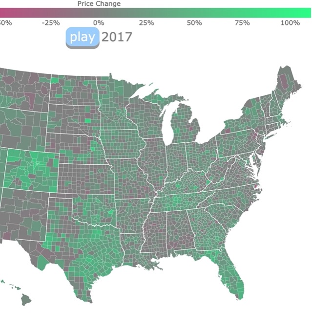
Population Growth and Migration affect Home Value too. Check this map with Housing Prices.
Resources and Inspiration for Race Pyramid
I have great interest in population trends and statistics. I like to observe and analyze population pyramids from different countries and how they are affected by war, famine, disease, or economic development.
I thought it would be interesting to add race as an extra variable to the US pyramid.
This population pyramid was inspired by the 2018 news about the USA being a Minority Majority country. Also by news stating the US had more minority children than white children.
With all this talk about race, I wanted to see and display how these new trends look like. Also find how much they will change the composition of the USA population.
Therefore, I looked into the US population projection for the next 50 years and made it into an animated pyramid.
According to 2017 National Population Projections, "Hispanic origin is considered an ethnicity, not a race. Hispanics may be of any race". Therefore, Hispanics are not depicted in this pyramid.
Further information at NP2017_D1: Projected Population by Single Year of Age, Sex, Race, and Hispanic Origin for the United States: 2016 to 2060.
The code for the stack bar was obtained from ywwhack's block.
I thought the best way to do this race pyramid, was to make a stacked bar. This way I could add an extra variable to the population pyramid. Not just sex and age, also RACE. Made by Luz K. Molina.
A detailed version of the inspiration behind this visualization is in this short piece I wrote in MEDIUM Why I made Race and Ethnicity Population Pyramids.
Follow Me
This graph will be updated with improved and recent information! To receive updates on this and more visualizations join my email list!!!!!!!
Created using d3.js.