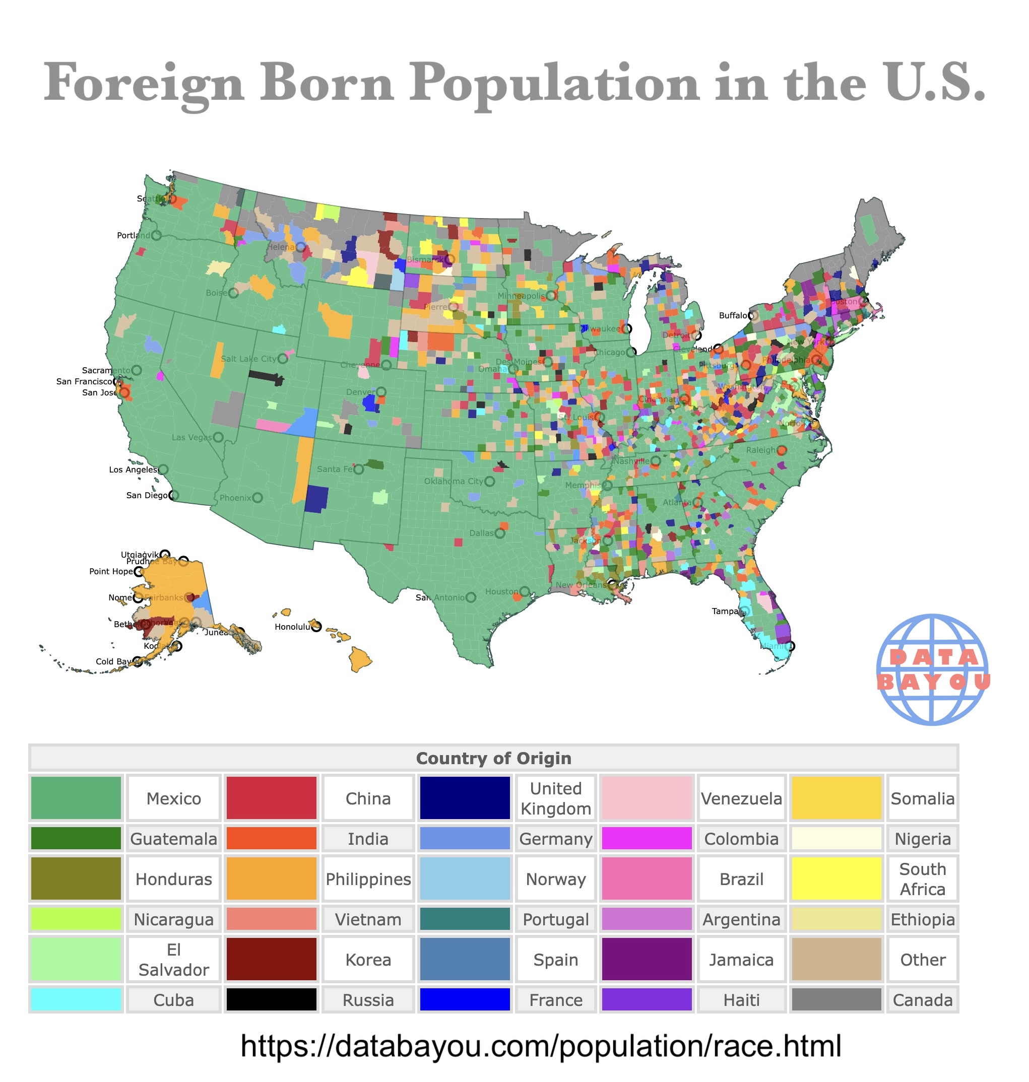
Largest Foreign Born Population by U.S. County
This is an interactive map of foreign born population by county. Each color represents the predominant foreign born population by country. Hover over the map to see the county, state, population, country of origin and largest population by origin. Zoom in for more detail. Scroll down for more information.
| Country of Origin | |||||||||
|---|---|---|---|---|---|---|---|---|---|
| Mexico | China | United Kingdom | Venezuela | Somalia | |||||
| Guatemala | India | Germany | Colombia | Nigeria | |||||
| Honduras | Philippines | Norway | Brazil | South Africa | |||||
| Nicaragua | Vietnam | Portugal | Argentina | Ethiopia | |||||
| El Salvador | Korea | Spain | Jamaica | Other | |||||
| Dominican Republic | Russia | France | Haiti | Canada | |||||
| Cuba | |||||||||
Foreign Born Population
The United States started as a country of immigrants. The number and origin of immigrants have changed drastically throughout the country's history.
These immigrants have shaped the culture and costummes of the United States.
This map shows the largest source of immigrants in each county from 2018 to 2023.
These numbers do not represent the immigration status, just the place of origin. The data is from the U.S. Census American Community Survey.
To learn more about migration, Amazon has Migrant Midwest: The Case for Immigration and Economic Growth in the American Heartland.
This book illustrates how the forces of fertility and migration drove the development of the region's agricultural and industrial economies, and how the region has more recently struggled with deindustrialization, outmigration, and declining fertility, a global trend.

Map of Median Age by County
Largest Immigrant Groups
The largest immigrant groups overall are:
- Mexico: ~10.9 million (23% of total immigrants)
- India: ~2.9 million (6% of total immigrants)
- China: ~2.4–3 million (5–6% of total immigrants)
- Philippines: ~2.1 million (4–4.5% of total immigrants)
- El Salvador: ~1.6 million (about 3% of total immigrants)
Counties with the Largest Immigrant Population
The following counties have the largest immigrant population.
- Los Angeles County, California (Los Angeles): 1,152,597 mainly from Mexico
- Miami-Dade County, Florida (Miami): 671,598 mainly from Cuba
- Harris County, Texas (Houston): 458,708 mainly from Mexico
- Cook County, Illinois (Chicago): 390,248 mainly from Mexico
- Dallas County, Texas (Dallas): 308,669 mainly from Mexico
For an indepth look at immigration, Amazon has The Truth About Immigration: Why Successful Societies Welcome Newcomers.
In The Truth About Immigration, Wharton professor Zeke Hernandez draws from nearly twenty years of research to answer all the big questions about immigration.
Buy or Rent Mapped
Counties with the Largest Percentage of Immigrant Population
The following counties have the largest percentage of foreign born population.
- Kenedy County, Texas: 36% mainly from Mexico
- Santa Cruz County, Arizona: 33% mainly from Mexico
- Maverick County, Texas: 29% mainly from Mexico
- Ochiltree County, Texas: 29% mainly from Mexico
- Aleutians West Census Area, Alaska: 28% mainly from the Philippines
Immigrant Groups
The countries of origin of these prominent migrant groups reflect the geography of America, and the world's demographics.
Candada, Mexico, El Salvador, Honduras, and other Central American countries reflect the proximity to the United States.
The strong economy of the US is also a big magnet for the migrants of these countries.
Asian countries like India and China, not only reflect the economic interest of its migrants, but the large population of each country. They hold the largest populations of the world.
Cuban immigration reflects the politics of its country, as many Cubans left the island looking for refuge from its communist party.
The other groups definitely reflect the desire of these migrants to improve themselves and work to earn a better quality of life.
There are poquets of European immigrants in California and Florida searching for warmer weather.
Nevertheless, they are not visible in this map as they are probably blended with other more prominent groups.
Europeans seem to be more visible in low density population areas throughout the U.S.
Follow Me
Resources for Immigrant Map
The Shapefiles for the states were downloaded from Natural Earth.
The county shapefiles and immigrant group data came from the US Census Bureau American Community Survey.
Made by LKM with D3.js.
This map will be updated with improved and recent information! To receive updates on this and more maps, join my email list!!!!!!!