


I started creating visualizations while doing my Masters degree thesis. I realized I liked trying to explain my data to the public through graphs. I discovered that there was a field of science communication. This field was about what I was trying to do. I also discovered that among them, there where scientists using data visualizations to communicate complex topics in their fields. I decided to pursue a PhD in the field. This gave me the opportunity to research other works related to maps, charts, and graphs.
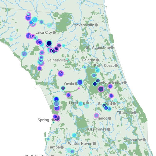
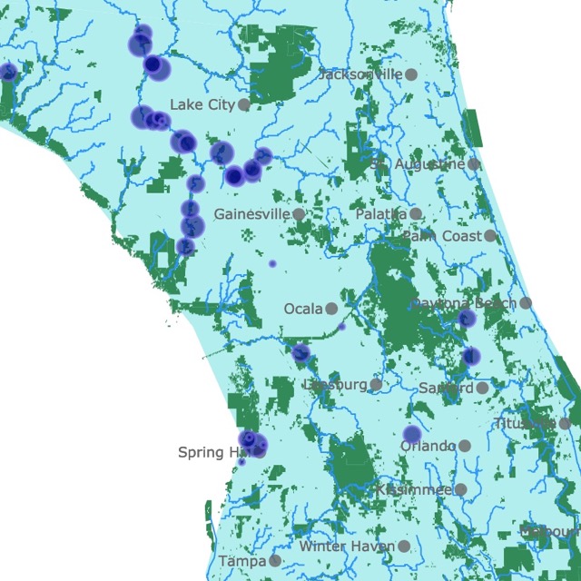
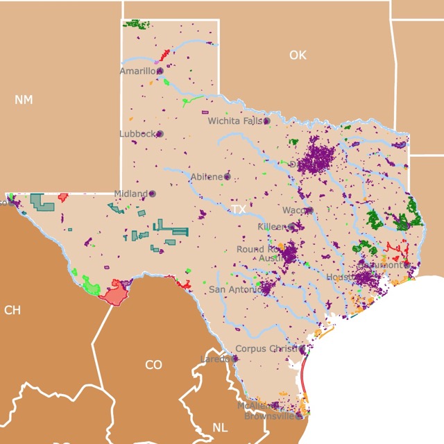
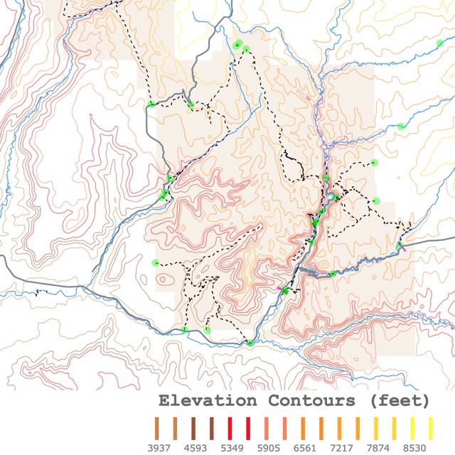
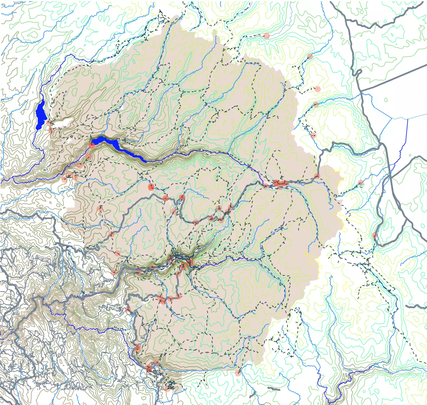
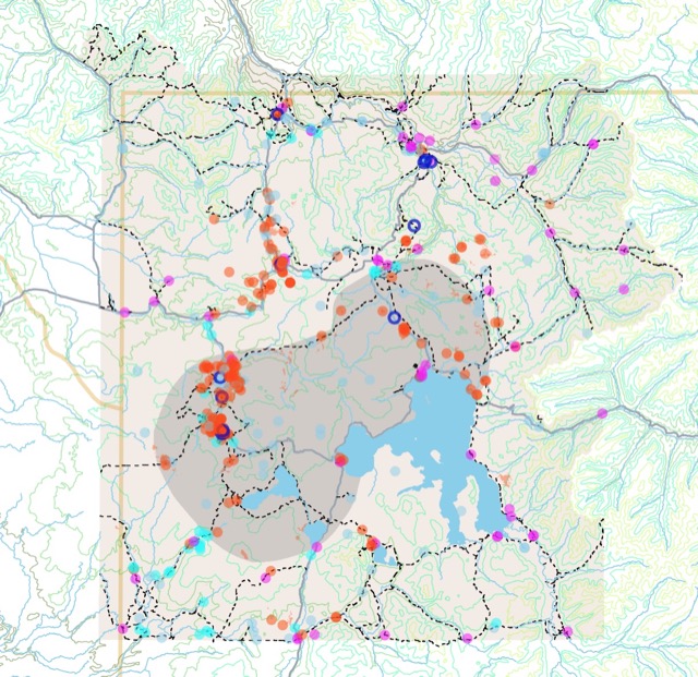
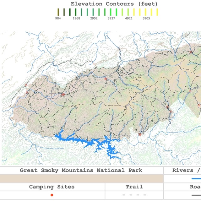
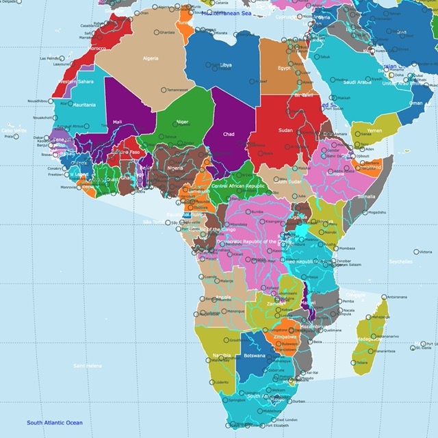
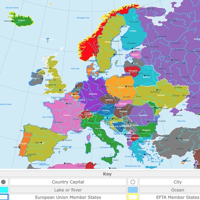
I created this space to answer questions I had in relation to different topics and to learn as I practice what I have learned. As a Biologist with a background in Oceanography I had the initial intention of displaying only such topics. I realized that there were many other subjects I wanted to explore. I also wanted to look into areas that the public would like to learn about. This is why the range of topics is so wide. Lately I have made a lot of maps. This is not just because I love geography, but also because it is a graphical form that most viewers understand. Some of the first visualizations were part of visualization challenges. These are not as popular as they used to, but they helped me try different software libraries and eventually see how other competitors where showing their data. Comparing graphs, methods and ways people represent the data is an excellent way of learning more about visualization. Many of these first attempts have different designs and forms. This was great to experiment. Now I am more tame in my displays.
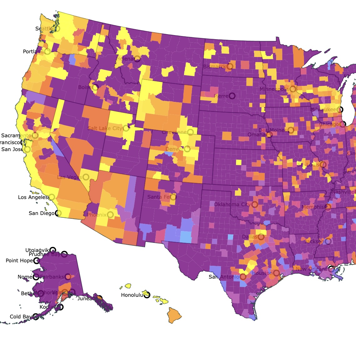
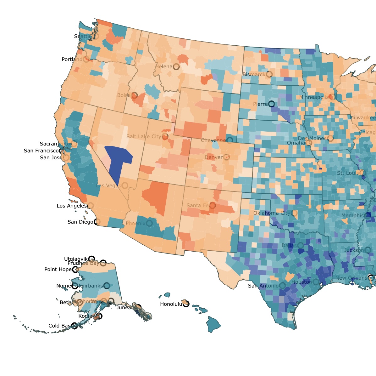
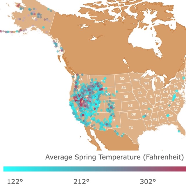
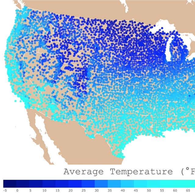
I am still daring on the use of color. I am personally attracted to strong and vibrant colors. I blame my upbringing in the Caribbean for this. Nevertheless, I am starting to look for color palettes. This way I am less likely to offend viewers with a pop of color. There are different resources like the Color Brewer for maps and Datawrapper suggestions for choosing colors. These are great ways to accomplish colors the viewer will understand. I am still experimenting, and I find some of this suggestions repetitive. It is just a personal choice and I am still working on finding hues that satisfy me and the viewers.
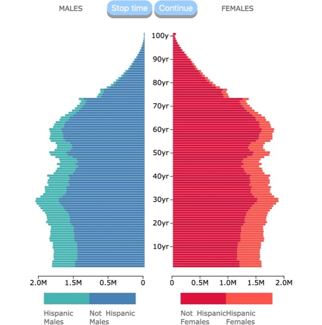
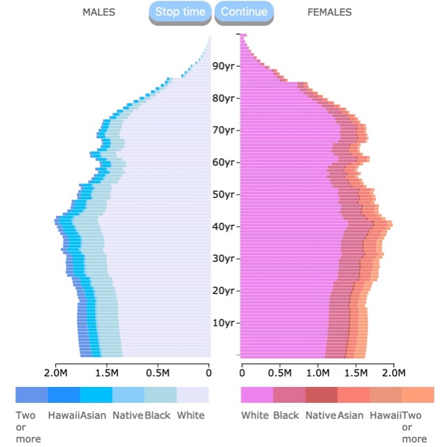
Just recently, I ordered the visualizations by topic or type, but you can clearly see some of the designs have been reused to create new visualizations. I have used the code of a successful visualization, made some changes to use new data, and adapted the graph to present a new idea or topic. This way I can publish more visualizations in a shorter time. It also allows me to show different topics of interest quickly. The first of these series was the population pyramid set. These couple of visualizations show U.S. population by Race and Ethnicity in that order. To explain a bit about them I wrote a piece on MEDIUM.
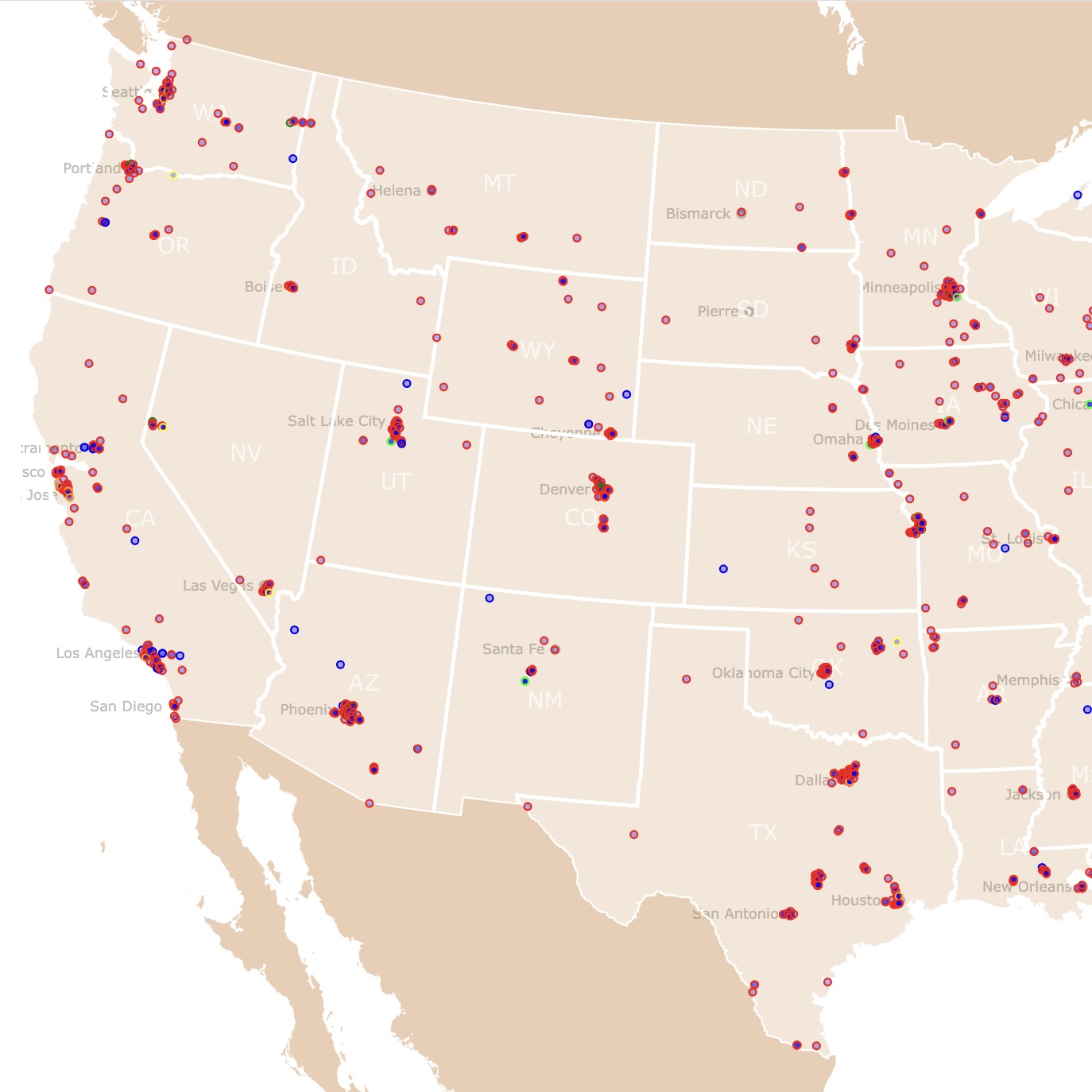
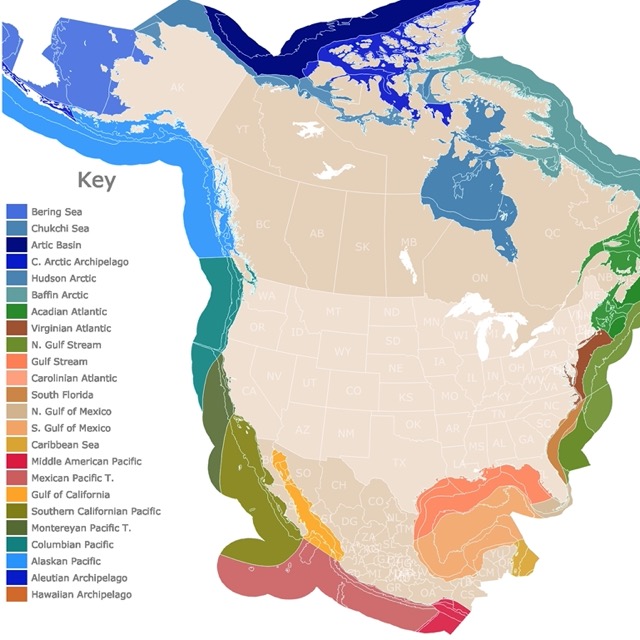
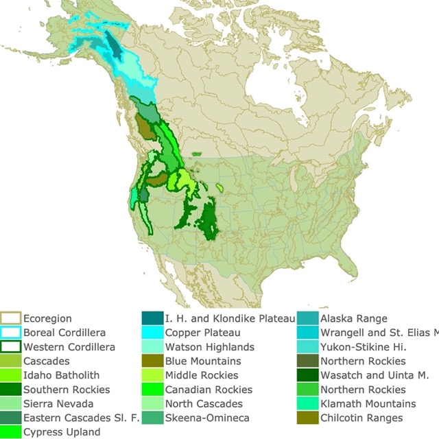
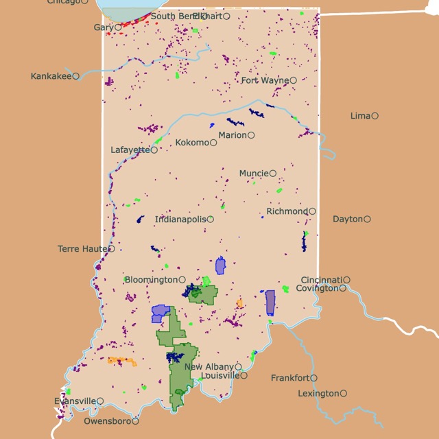
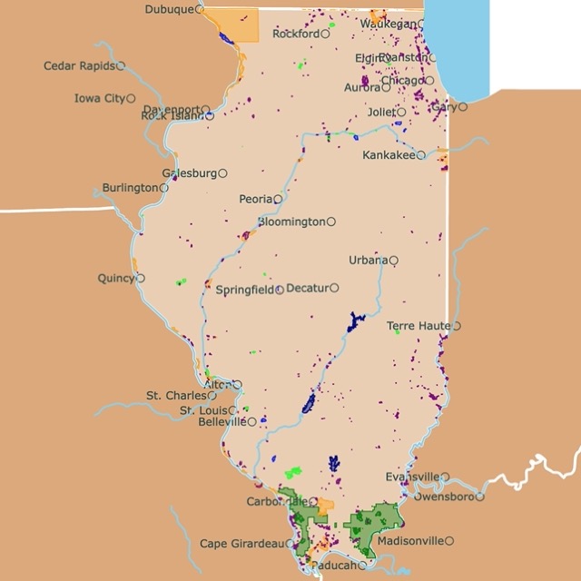
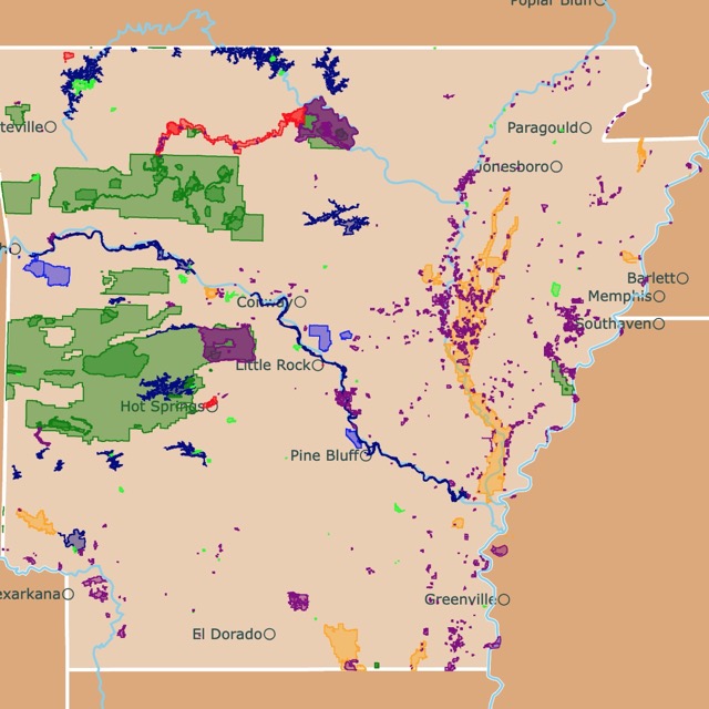
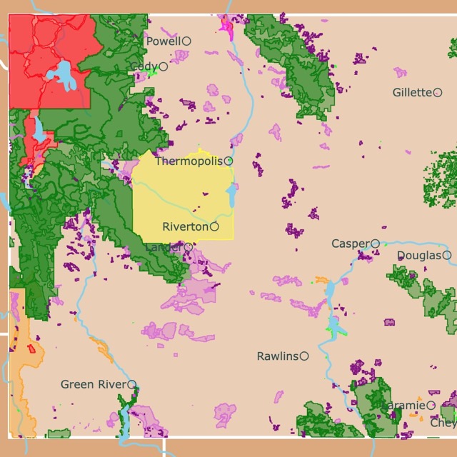
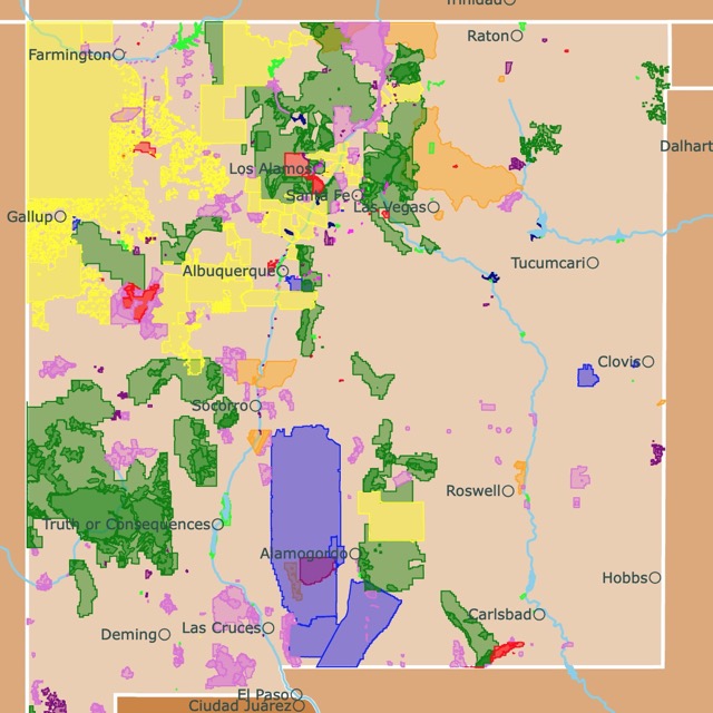
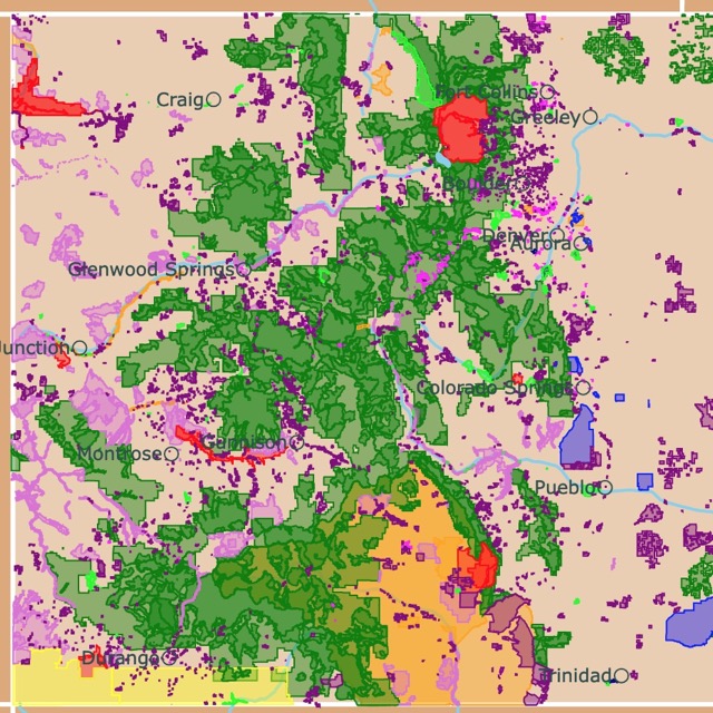
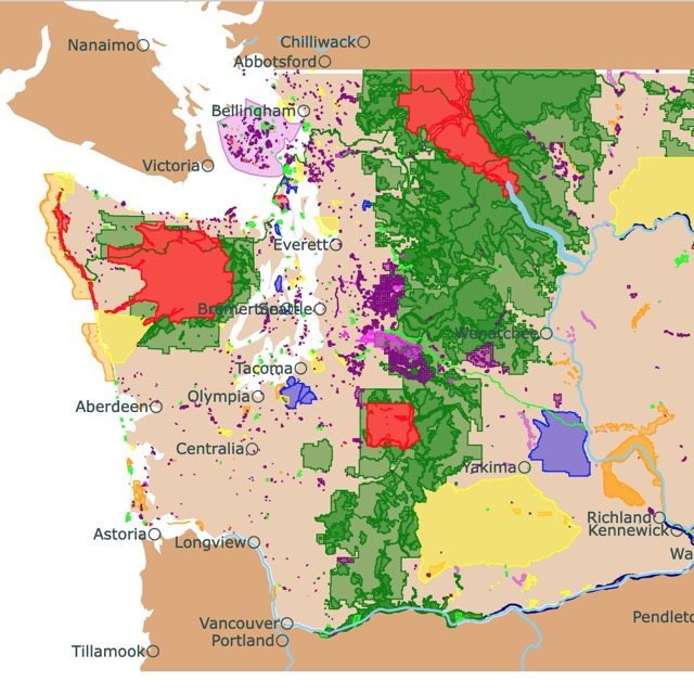
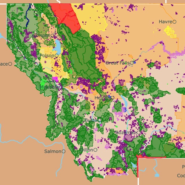
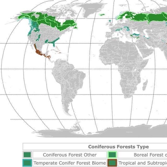
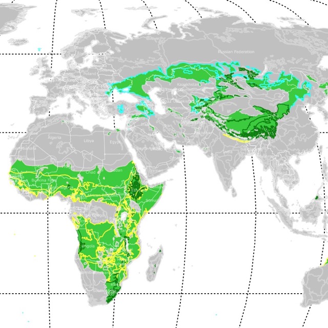
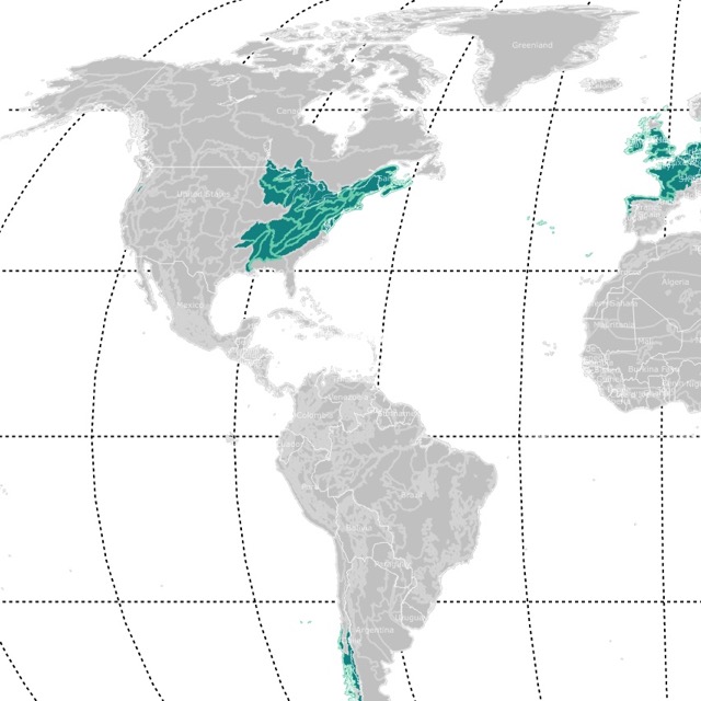
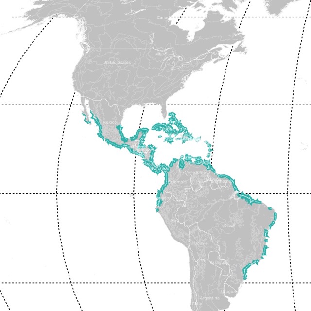
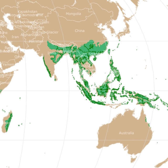
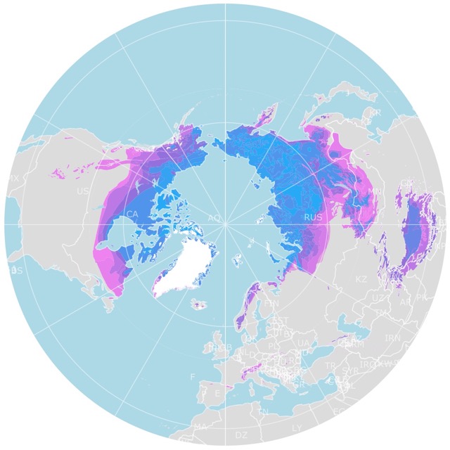
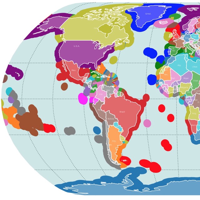
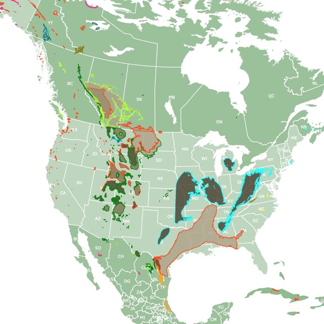
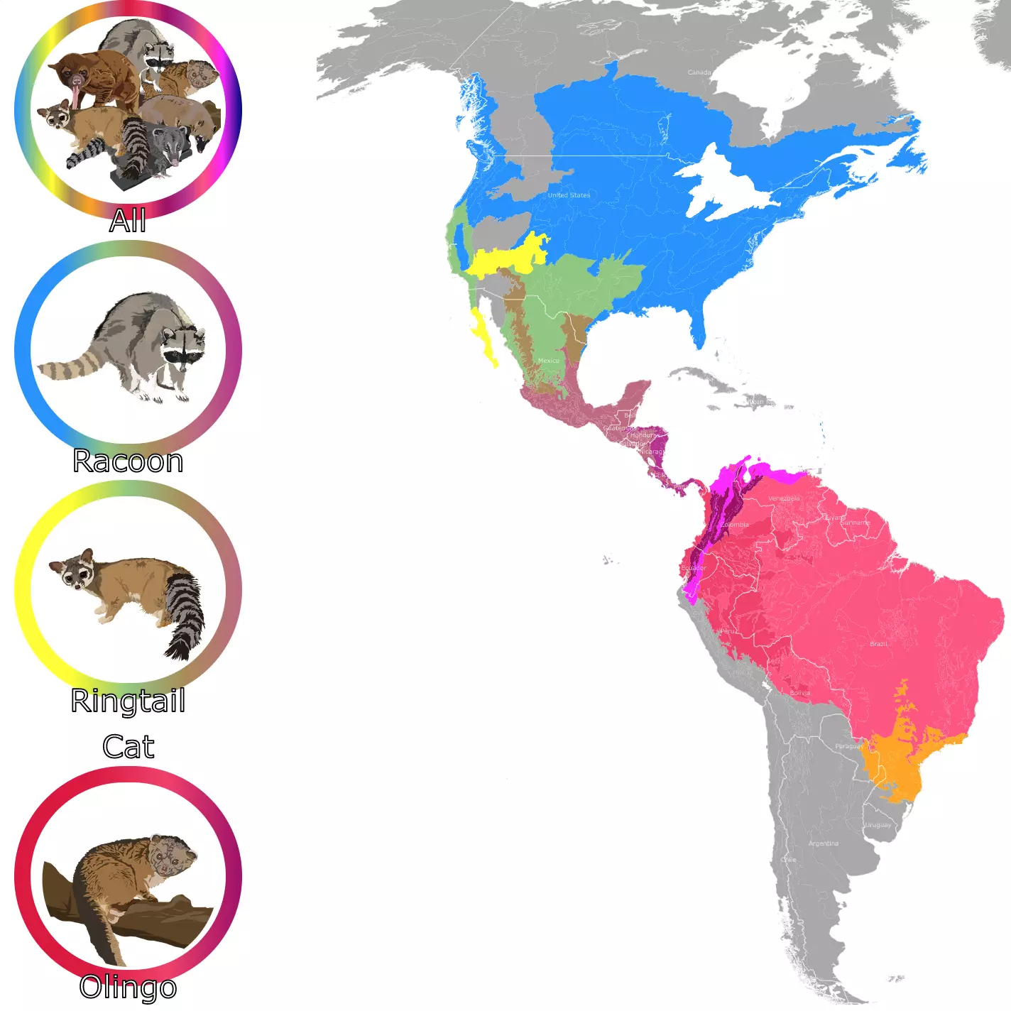
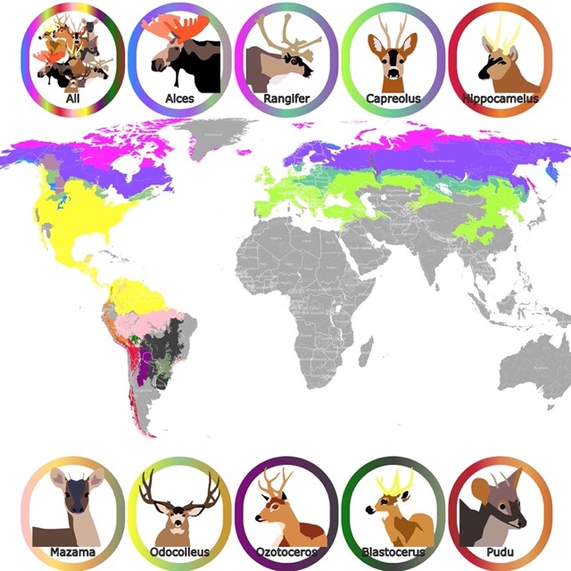
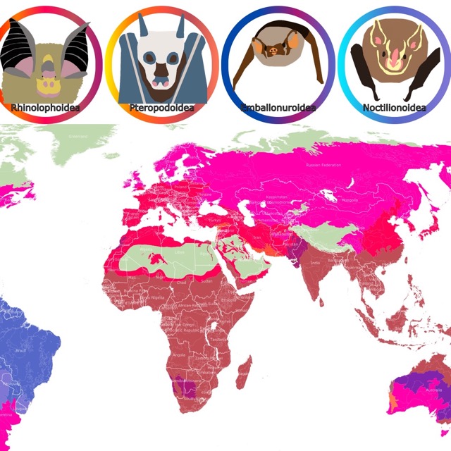
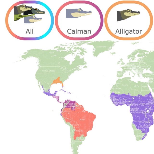
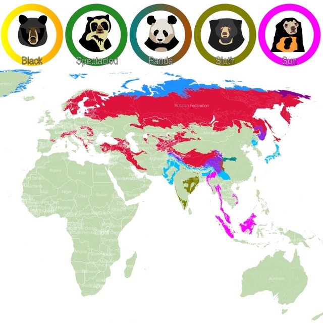
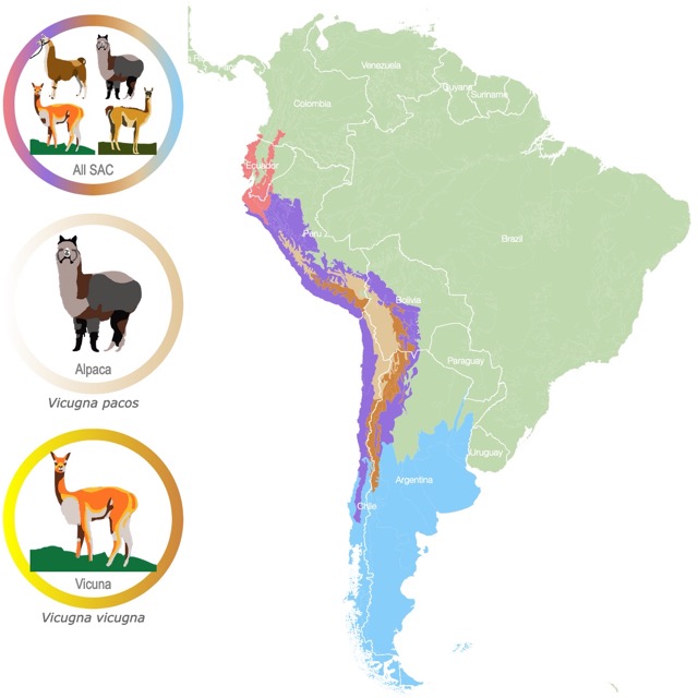
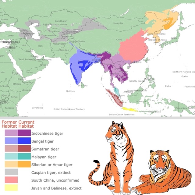
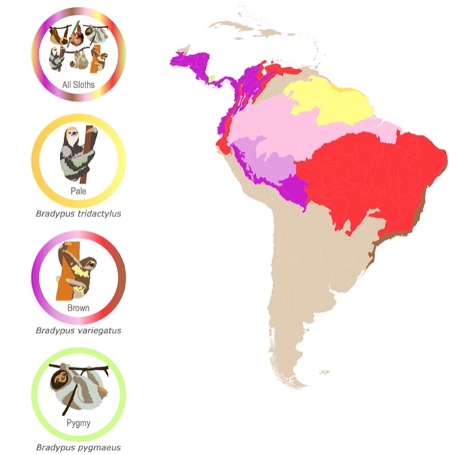
The habitat maps started as a look into one of my favorite animals. Sloths are native to South America and are found in different overlapping habitats. I thought it was worth making an interactive map that showed where each species lived. This is also why Llama and Alpaca map was made, and later the Tiger subspecies map. This last one, focuses in the extinct subspecies and habitat loss. I finally focused my attention in Bears. The beauty of the Bear habitat map is that it includes most continents, and a lot of species. Regardless of the number of species, I think the map works. The interaction allows for the viewer to see each species independently. As mentioned before they are quite colorful, but I made them thinking of attracting audiences to a serious topic in ecology, which is habitat loss. I also wanted a good contrast between species habitats.
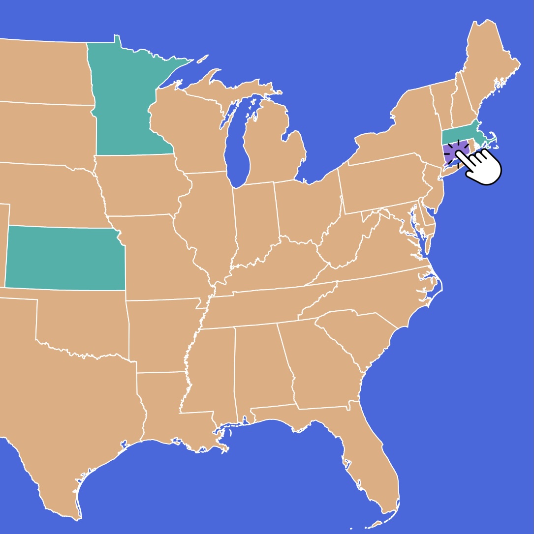
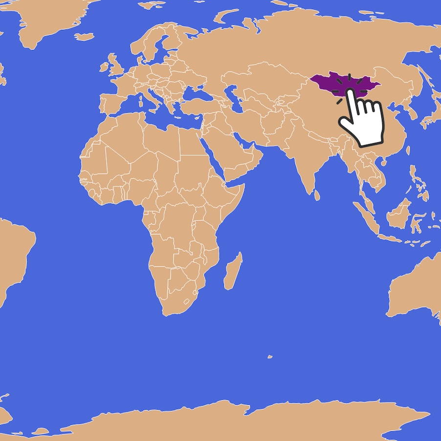
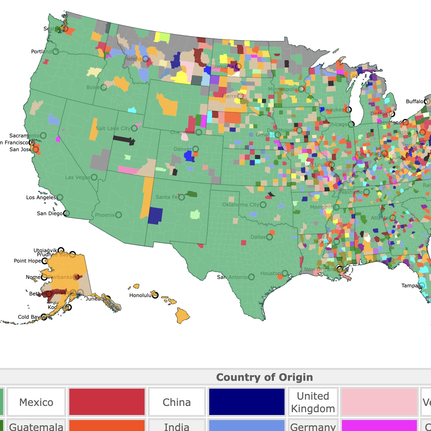
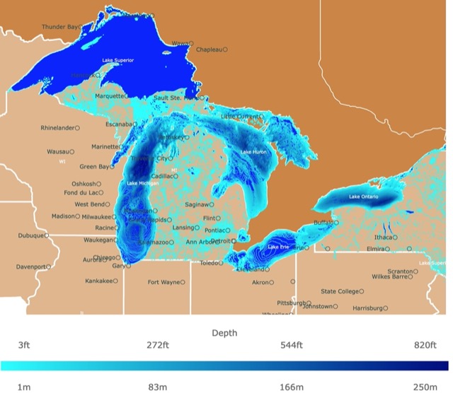
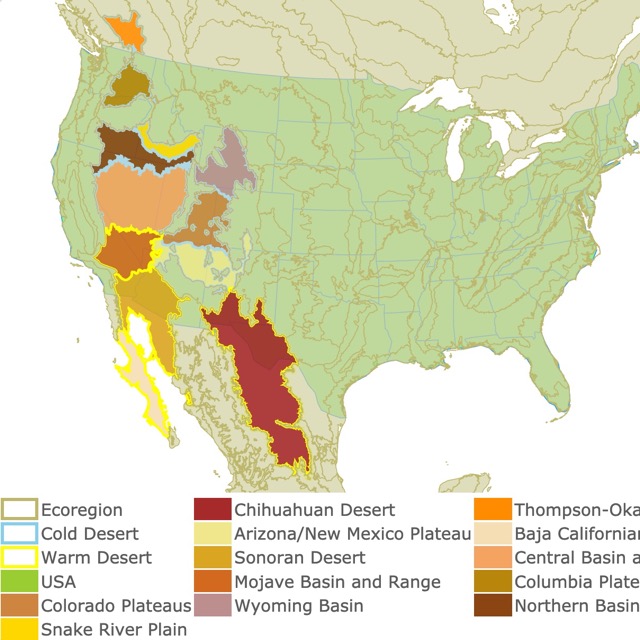
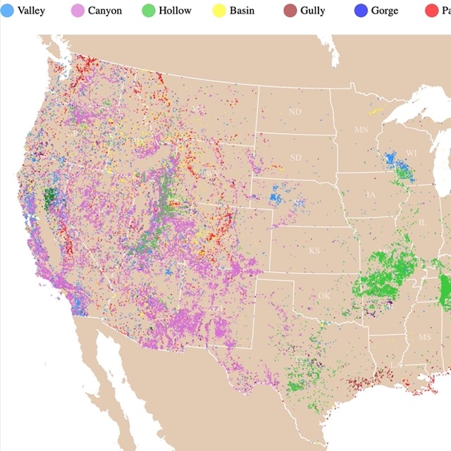
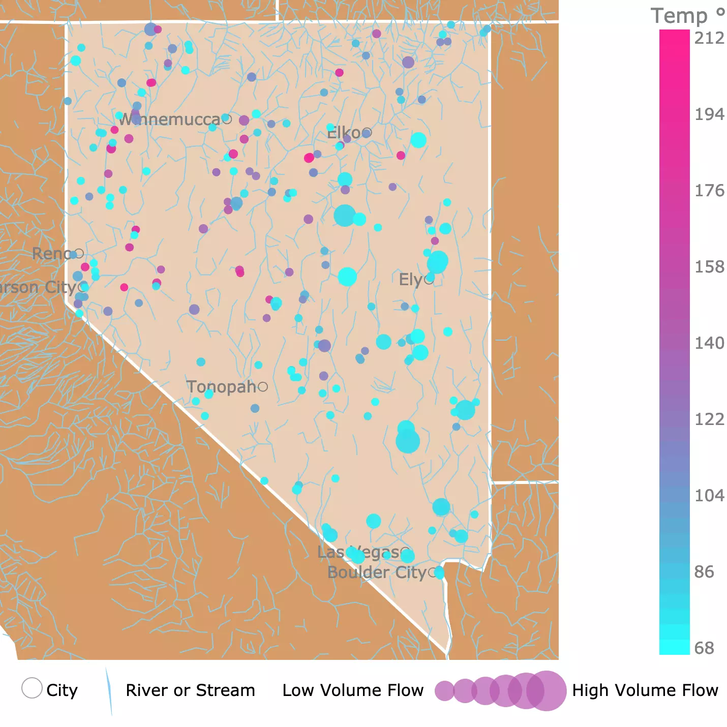
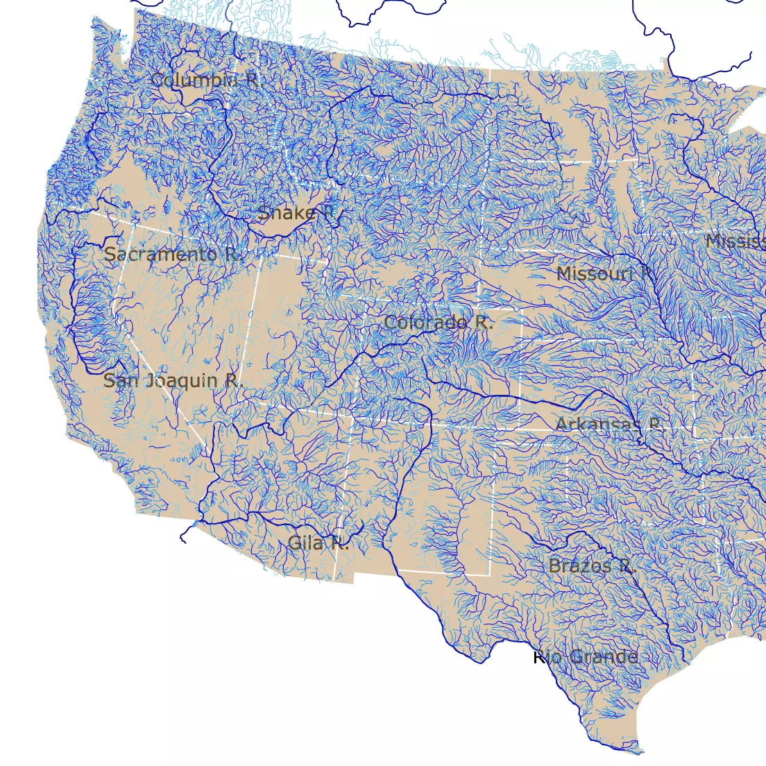
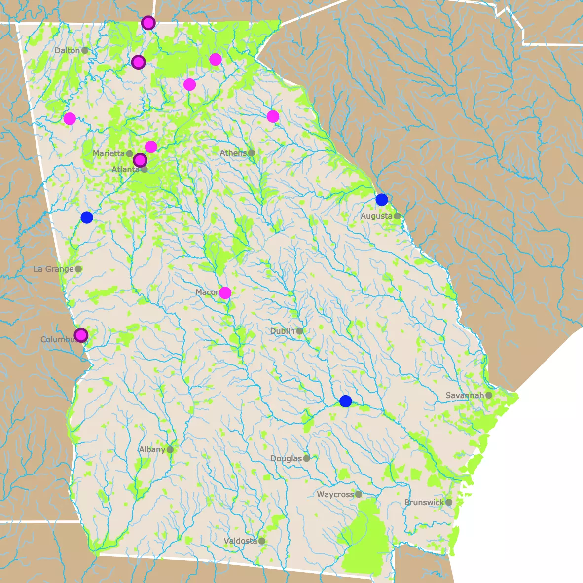
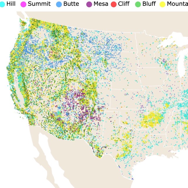
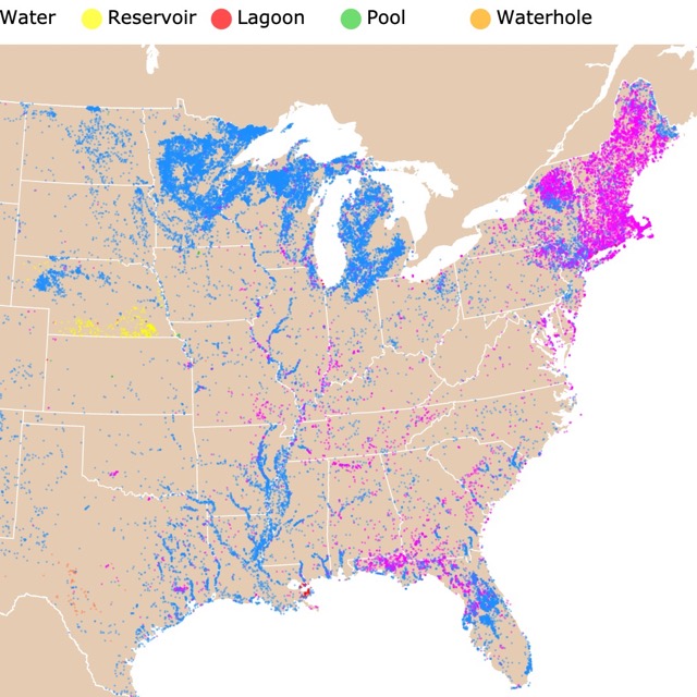
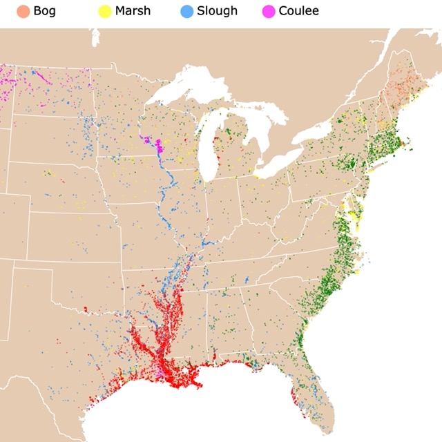
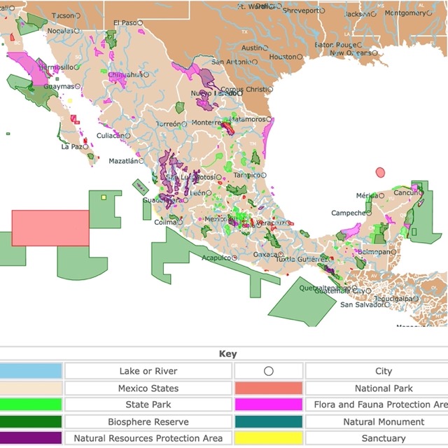
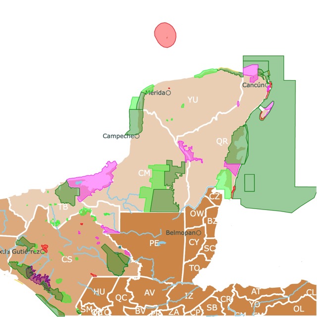
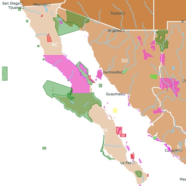
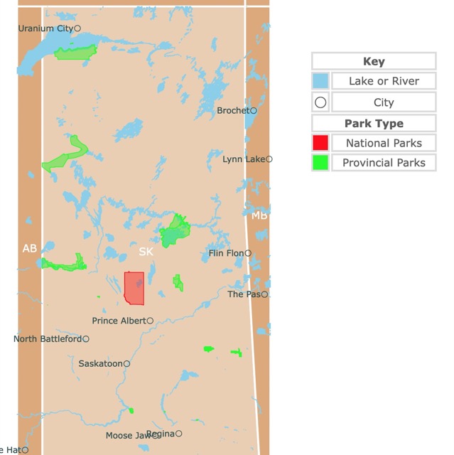
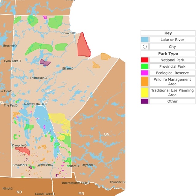
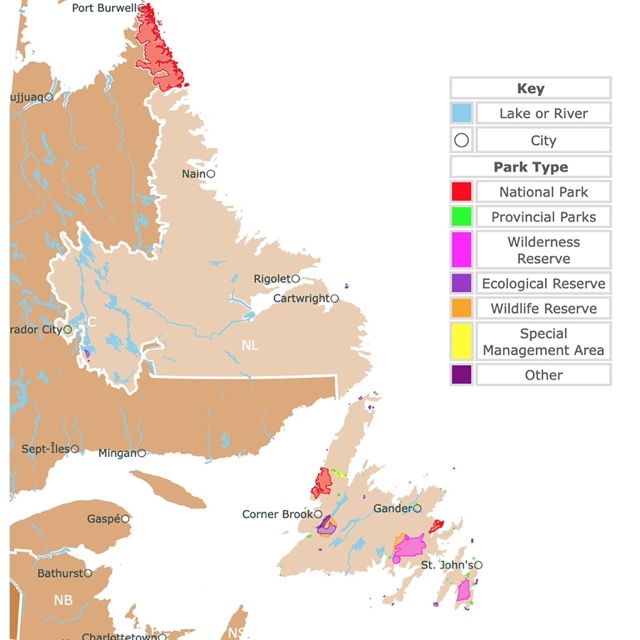
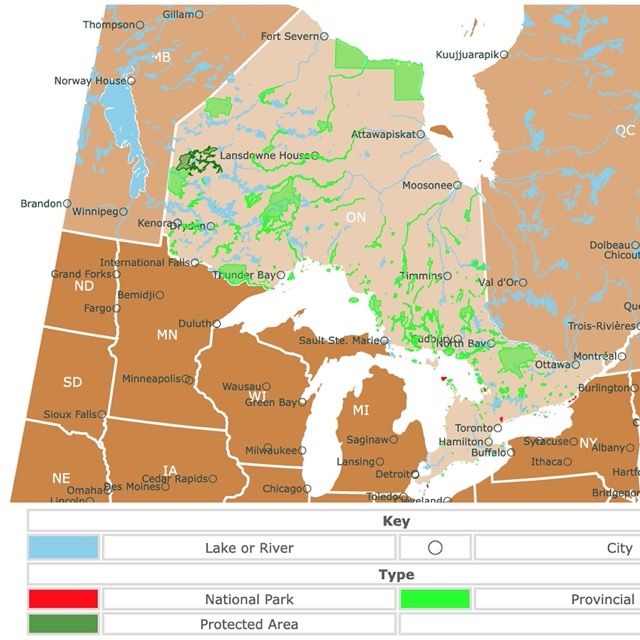
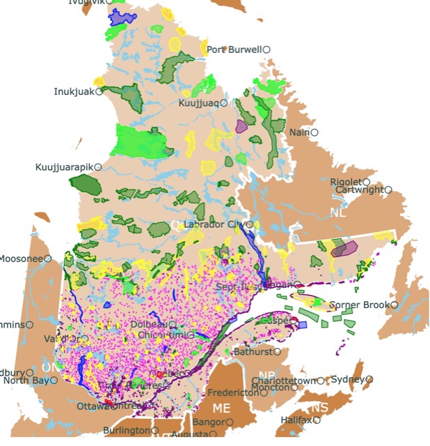
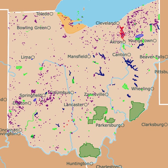
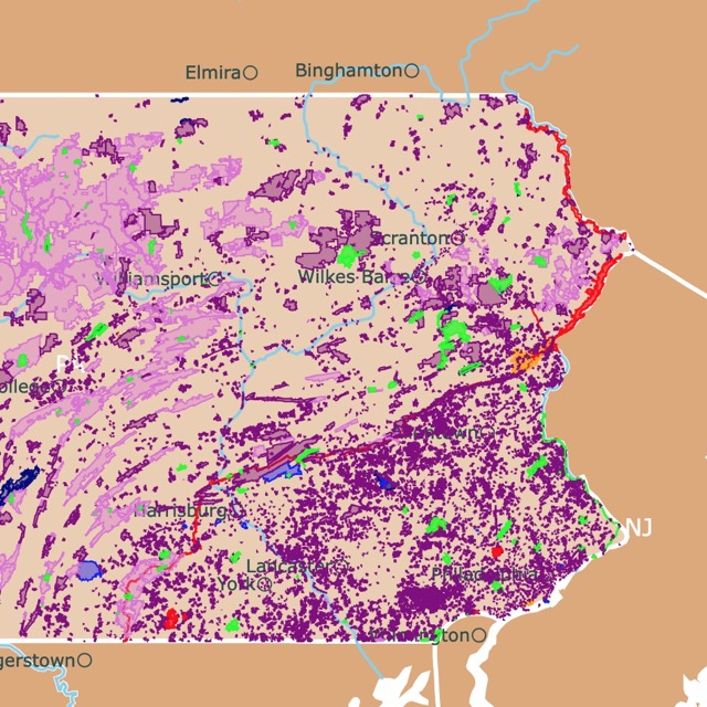
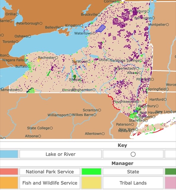
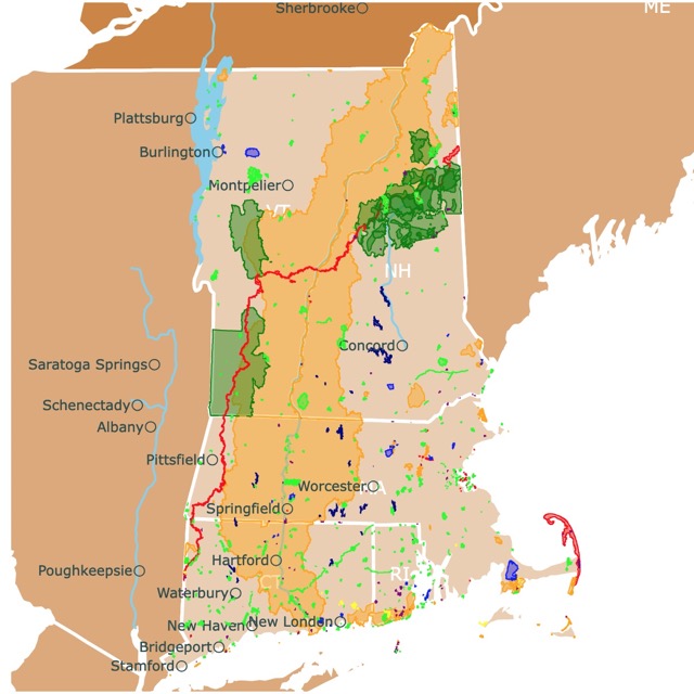
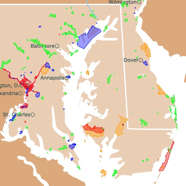
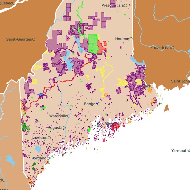
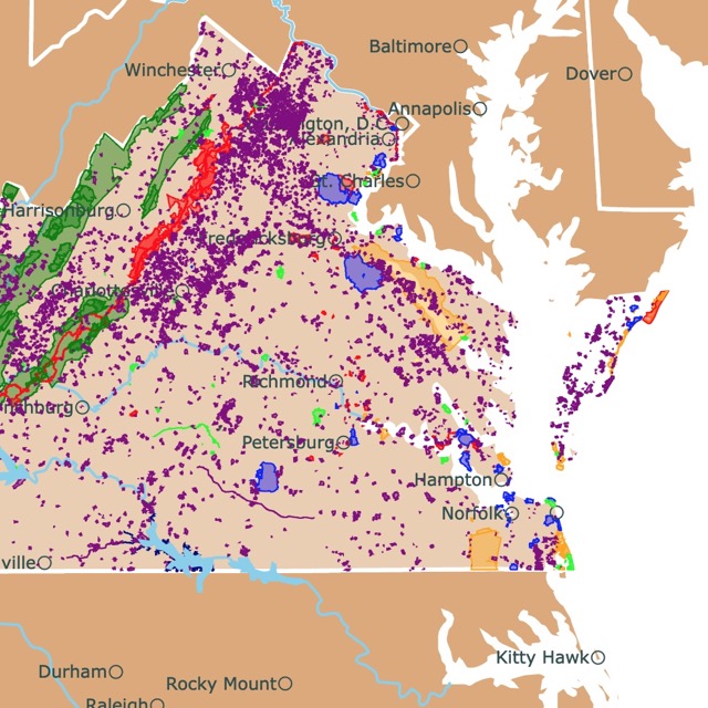
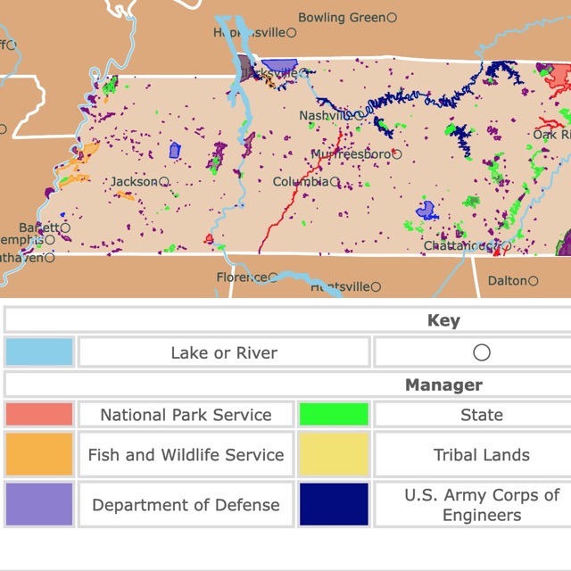
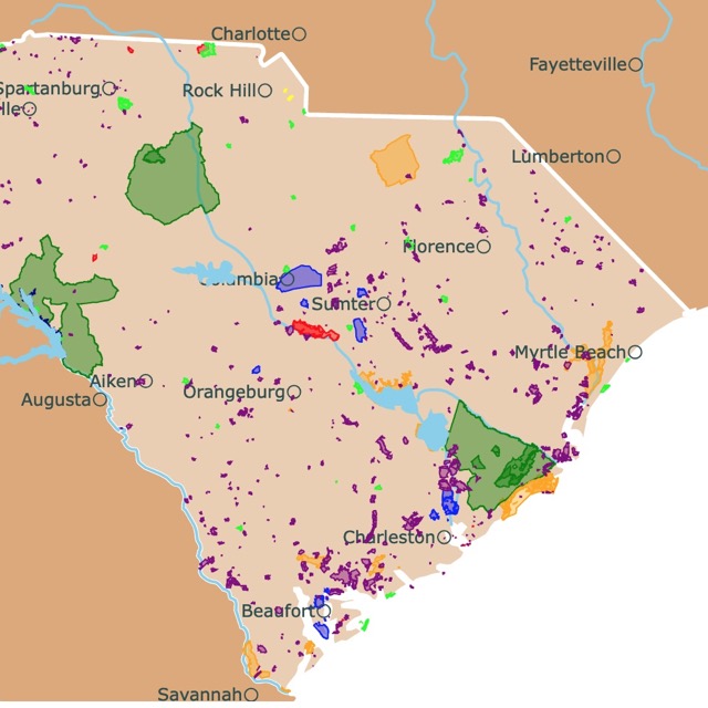
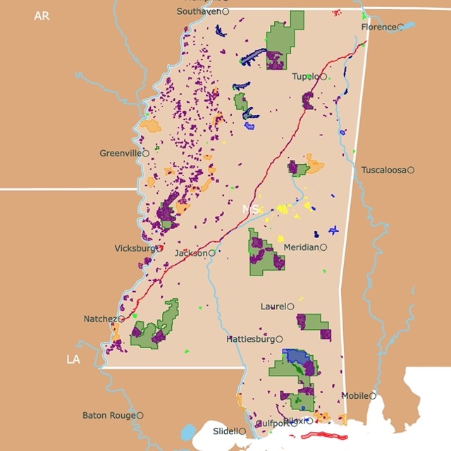
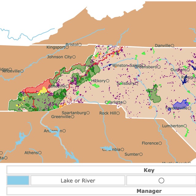
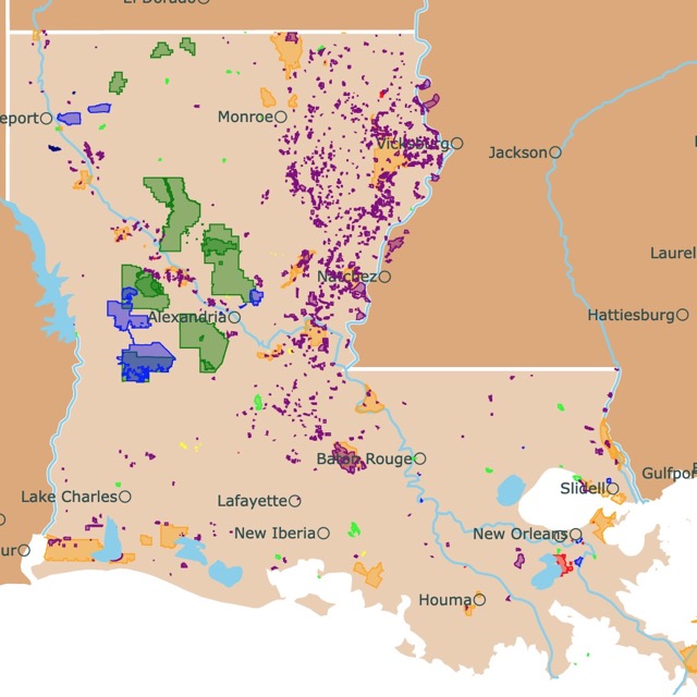
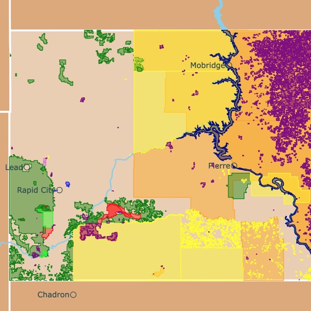
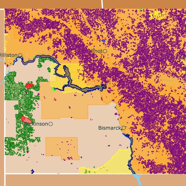
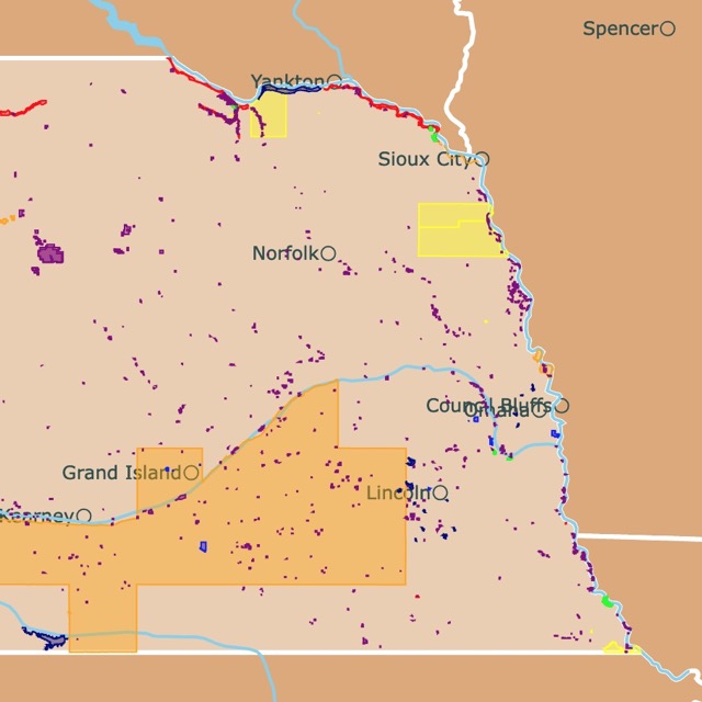
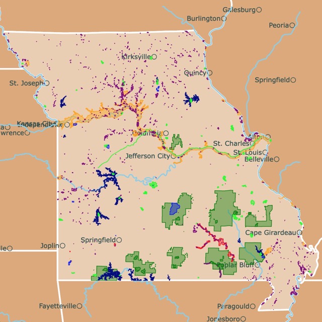
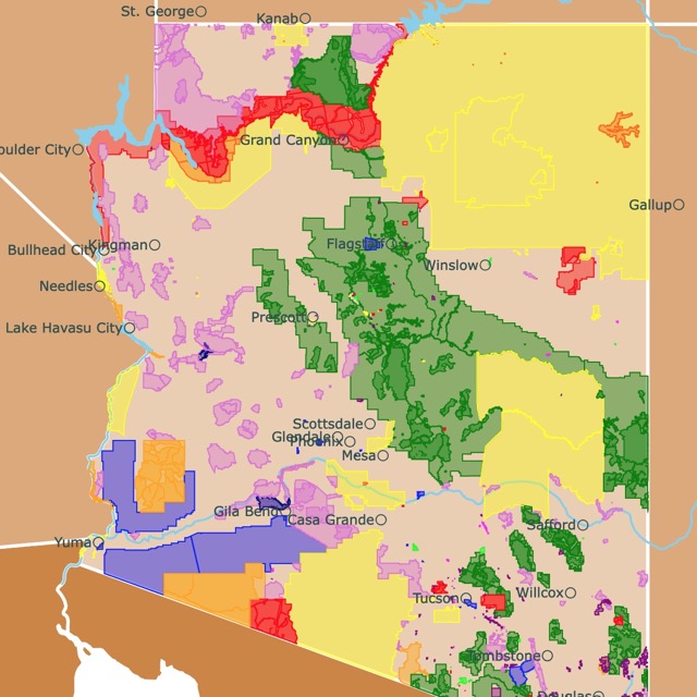
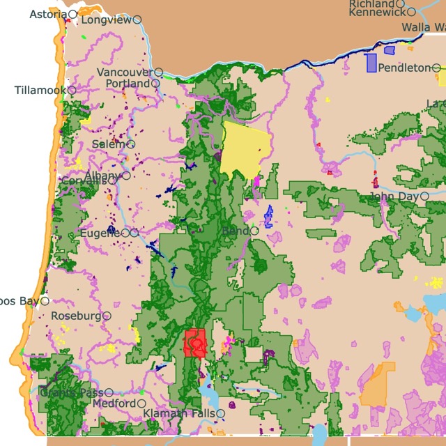
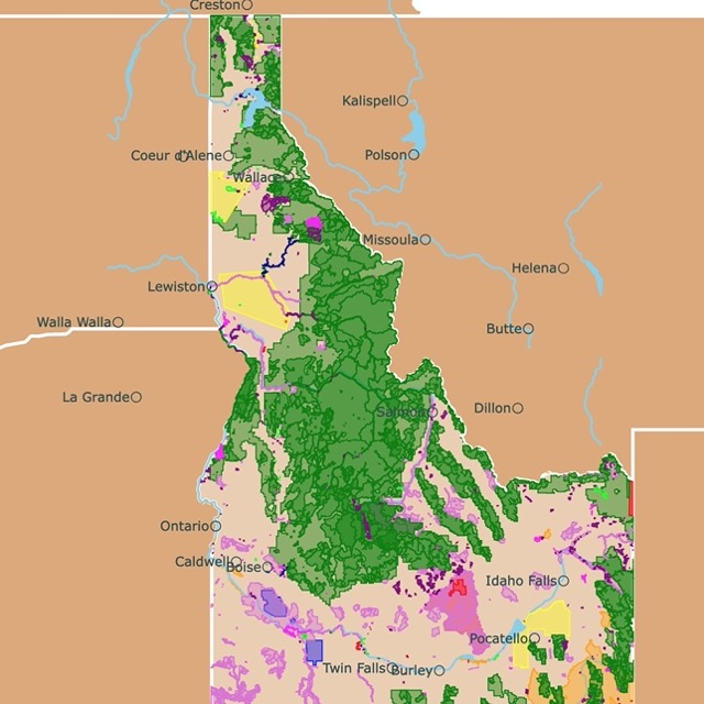
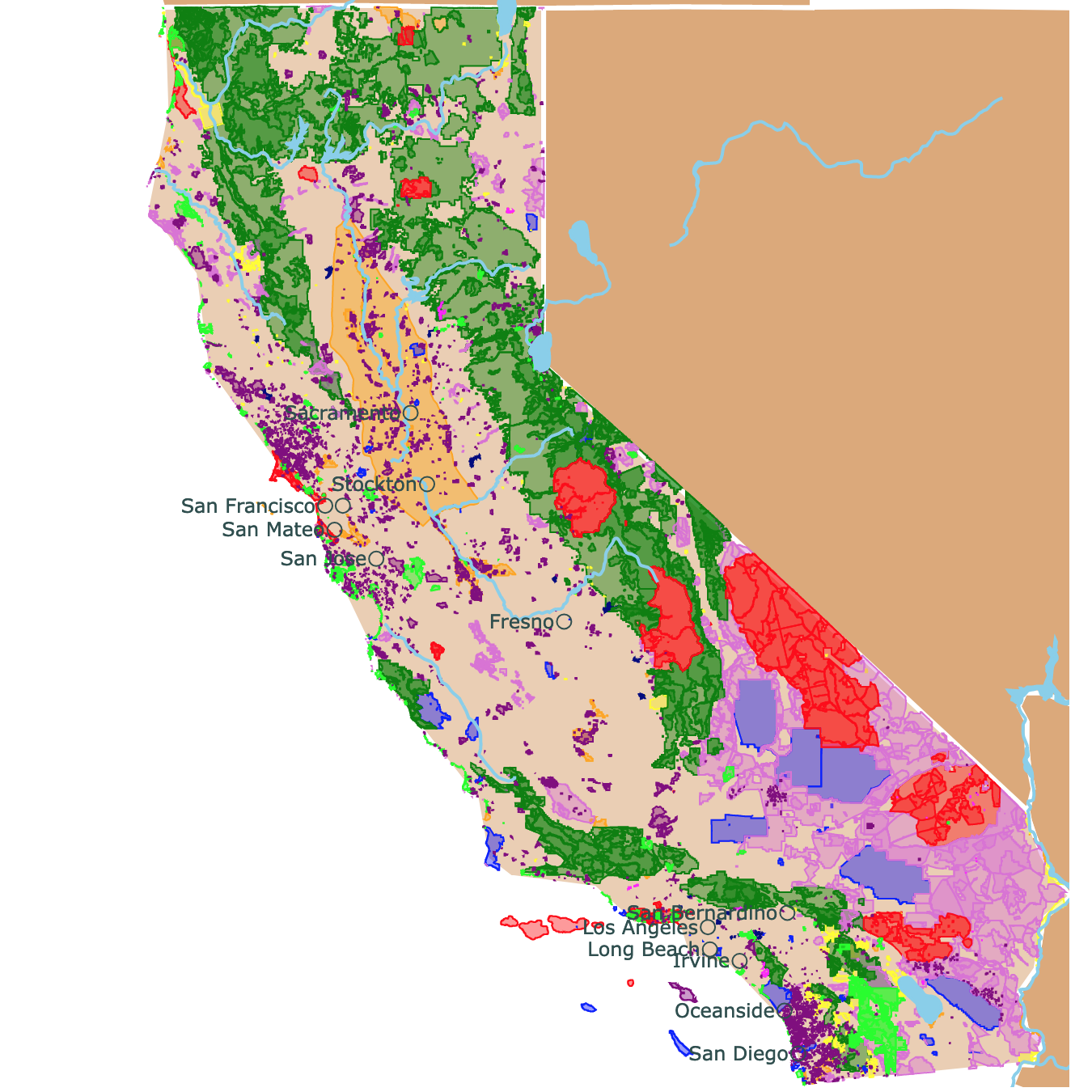
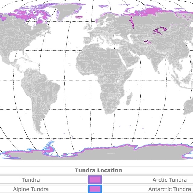
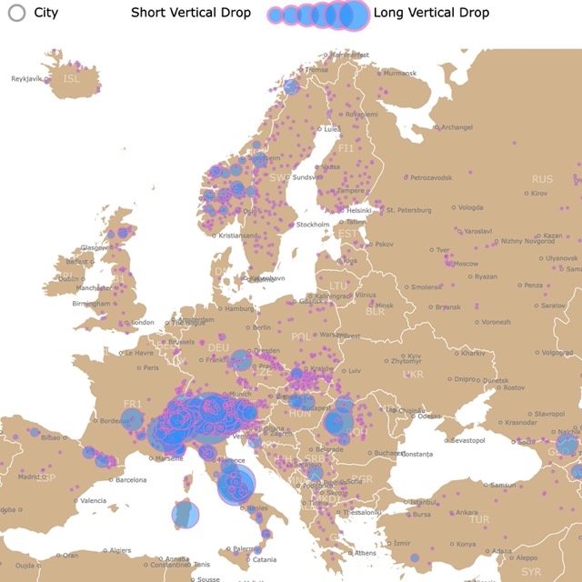
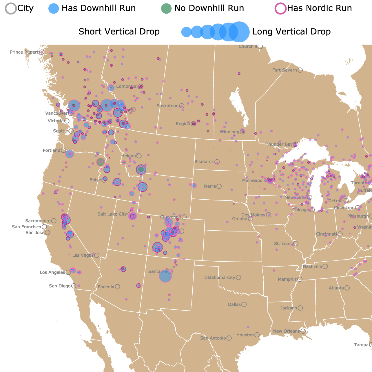
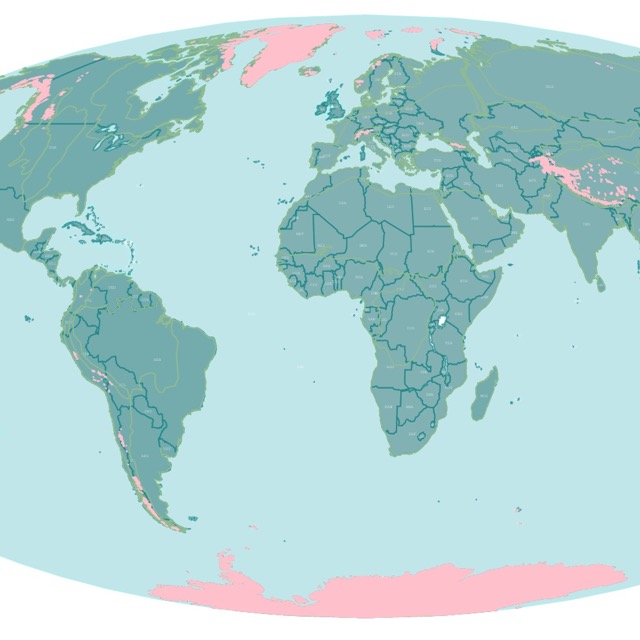
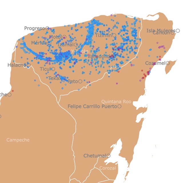
The final group is about name maps. I wanted to make a name map of different geographic features. It is an interesting way of looking at the history of an area. Since names are assigned depending on the people that live or lived in an area, you can differentiate areas where a particular name prevails.